

by Nick Iverson, Learning Experience Design Consultant
The look and feel of your learning program doesn’t really matter, does it?
When it comes to your learning programs and arguably most anything else you want to people to pay attention to you should be thinking of the look and feel as an important layer to the whole experience.
The look & feel is an opportunity to capture attention and spark connection with your learners. It can tie into an identity or brand that learners recognize, show them that a particular experience is different from the typical learning they’re used to, and even impact their perception of its credibility. So yes! The way you approach a look & feel matters because it can be part of what draws learners in and gets them curious about an experience they may want to engage in.
Here’s a few do’s and don’ts to help you think about look & feel for the next learning experience you create:
Do’s
Get to know your learners
Starting with the basics, it helps to find out about who this is for. Getting to know your learners will help you to see opportunities to build connection and relevance as well as guide your first choices about the direction of the look and feel. Ex. Who are the learners and why are they doing this? What’s their organization’s culture like? What’s in it for them - why should they care?

Screenshot of a coaching-centered experience featuring photos of individuals to communicate a personal, face-to-face feel.
Pick a theme that tells a story
Choose a few quick words to help you focus on the feel you’re aiming for. This can help you narrow your direction and at the same time build a theme that captures interest and attention. Keep it simple, Ex. Adventurous, creative, clean, modern.
What’s the imagery begins reflect that? What’s it about? Maybe you want the theme to be about people you’d feel comfortable talking to, or maybe it’s about reaching for a higher goal. Search for examples that will give you inspiration and help you visualize what that could look like.
Be creative but keep it simple. Aim for clarity. Is it interesting? Does it inspire a certain emotion? Is it easy to recognize and relate to? If you can tell the story in one sentence that makes sense for the experience then you’re on the right track.
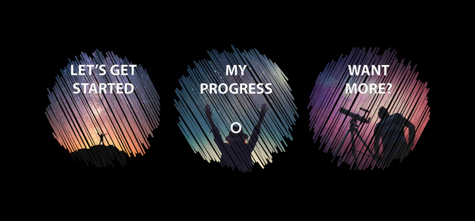 A screenshot of an onboarding experience demonstrating a theme of exploration, excitement, and curiosity.
Make specific choices about the style
Usually there’s an underlying style. Make specific choices that take it in a compelling direction. These questions will help you narrow what that is:
- Is it primarily photographic, illustrative, or abstract?
- What are 2 - 3 basic colors you want to use?
- What size are the content headings?
Within the basic colors you choose, include one color to distinguish interactions or calls to action. Also determine a size for headings that is both easy to read and easy to distinguish as a heading vs. subheading or body text. If you have the option to pick a font choose just one that is clear and easy to read.
Create some options to compare and build in time to get feedback. It can be as simple as getting reactions on an option A or an option B then moving forward in a specific direction. After a few iterations you may be surprised by the results!
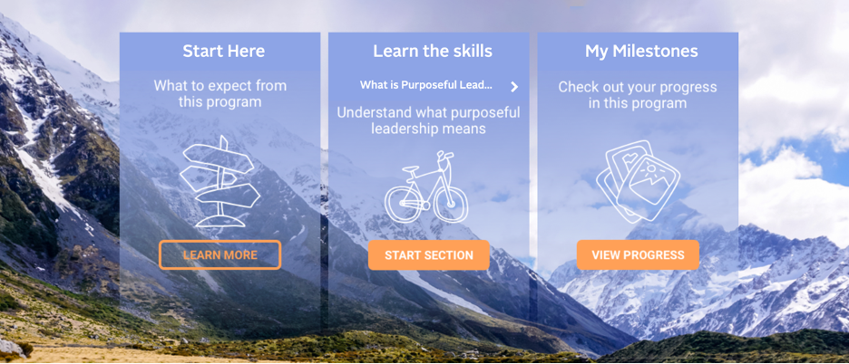
A screenshot of a leadership experience showing specific style choices: photography for background imagery and line illustrations for content icons, 2 - 3 basic colors including one color for interactions, and distinct font size for headings and subheadings.
Create good visual gestalt
When you look at a page it should be easy to perceive as a coherent whole. Each of the pieces in the look & feel should work together as part of a larger organization or system.
One way to achieve this is with consistency, continuity, and hierarchy. That means developing a pattern for the use of color, imagery, font, white space, etc. in a way that is repeatable and lends to a sense of the structure and flow. Is it easy to understand where to go at a glance or what to expect? Is it easy to skim to get the info you need?
For example, breaking up blocks of text can help make content easier to skim and assist readers in recognizing major sections. You may improve it even more just by using simple divider images to give it a clear, strong format. Good gestalt will help learners spend less cognitive energy on navigating and more time focusing on the learning.
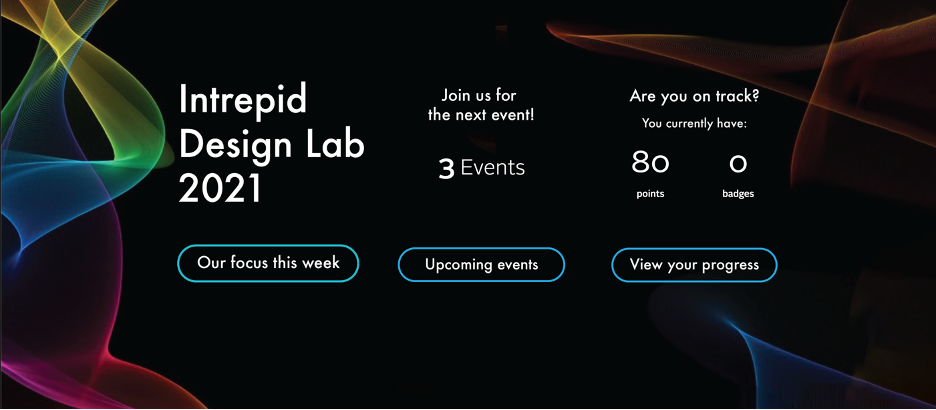 A screenshot of a design lab experience (action learning) exhibiting gestalt principles.
Make it accessible
Consider how the visuals perform for people with accessibility needs. Avoid low contrast colors, or color combinations, and font sizes that will make information or text difficult to see.
For example, red-orange or green hues can appear more like a muddled brown-green or gray to people with forms colorblindness. Ensure a 4.5:1 contrast ratio for text that is 18pt or smaller against its background. In addition to color contrast, use a font size and weight that is large enough to easily read. Utilize whitespace to chunk content and make the most important elements easily distinguishable.
Use crisp images and take care to unpack important text based content from images into real text. Real text will be more accessible across screen sizes and will be recognizable to screen readers. Where you have the ability, add alt text on images so screen readers can also describe what an image is. Include closed captions or transcripts for videos. Information and tools for improving accessibility are only a browser search away!
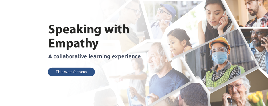
A screenshot of a collaborative experience using large and high contrast font so that the text is easily distinguishable against its background.
Don’ts
Don’t create a ransom note
Stop and step back once in a while. Are random stock photos and screenshots of documents taking over? When there’s too much going on it can make the experience feel disconnected, confusing, even frustrating.
A few ways to reduce the “ransom note” clutter:
- Use a small set of recognizable images and icons to represent types of content
- Create a limited set of colors and use one color for calls to action or interactions
- Create clear hierarchy for headers, sub-headers, and body text using one font
Don’t just fill the space
Avoid adding an excess of unnecessary elements. Make it easy for learners see and get what they need. Utilize your color, font, layout and white space to draw learners’ eyes to where they need to go. The right amount balance or contrast created by these elements is going to improve overall clarity and readability by bringing more focus to the piece that has most relevance and purpose.
Don’t overuse motion
Motion can make a strong impression and has a unique strength to draw the eye. When used well it can add just the right amount of interest or feeling via a touch of subtlety or punchiness.
However, motion can quickly become problematic if an image (like an animated .gif) auto-plays, loops endlessly, and competes with other motion elements on the screen at the same time. Too much motion can be distracting, irritating, even nauseating to the detriment of your learners and their ability to focus.
Be kind to your learners by using motion with discretion. Limit the amount of moving elements on screen to just one at a time. Consider limiting the length of time that animations loop and choose motion elements that will only improve the experience. Aim to keep your learners curious and excited for the experience!
WANT TO KNOW MORE?
Design:
- 13 Graphic Design Tips & Tricks (Stefan Schulz, ddiy.co)
- Visual Design Basics (Usability.gov)
- What is Gestalt Psychology (Kendra Cherry, Verywellmind.com)
- Hierarchy of Trust: The 5 Experiential Levels of Commitment (Katie Sherwin, NNgroup.com)
Accessibility:
- WCAG 2.1 text contrast recommendation (W3.org)
- Web accessibility guidelines (Princeton.edu)
- ADA Website Compliance (Stefan Schulz, ddiy.co)
- The A11Y project (A11yproject.com)
Tools:
- Color blindness empathy test browser extension (Vinceumo.github.io)
- Color contrast checker (Colorshark.io)
- Auto-transcription (Otter.ai)